Why Your Fundraising Emails Look Like They Were Sent by a Robot (And Why We Fixed Ours)
Most nonprofit platforms treat email as an afterthought — generic templates that undermine the trust you've spent years building. We built a unified design system for every email GiveLink sends, because every touchpoint is a brand moment.
On this page
Here's a test: open the last donation receipt you received from a nonprofit you support. Look at it for three seconds. Does it feel like a letter from an organization you trust — or like an automated notification from a SaaS app?
For most fundraising platforms, it's the second one. And that's a problem nobody talks about.
The Afterthought Problem
Nonprofit software has a design problem that starts with a reasonable-sounding excuse: "We're a tool for nonprofits, not a design agency." So the emails get the minimum viable treatment. A logo slapped into a header. System font. Default blue links. Maybe a button that says "View Receipt" in a color that clashes with everything else on the page.
It works, technically. The donor gets the information. The tax receipt lands in their inbox.
But something is lost. The email doesn't feel like it came from the organization the donor chose to support. It feels like it came from whatever platform the organization happened to be using. The nonprofit's brand — the thing that earned the donor's trust in the first place — is nowhere to be found.
This matters more than most people realize. A donor who gives $100 to a local food bank and receives a polished, warm, personal-feeling receipt thinks: "This organization has it together." A donor who receives a generic transactional email thinks nothing at all — which is worse than thinking something negative, because it means you've wasted the only guaranteed touchpoint you have with that person after they gave you money.
What We Shipped
We just rebuilt every email GiveLink sends — all 15 templates — from a unified design system. Not a theme picker. Not a color override. A design system with shared components, consistent tokens, and a visual language that carries from our product all the way into every donor's inbox.
Here's what that actually means:
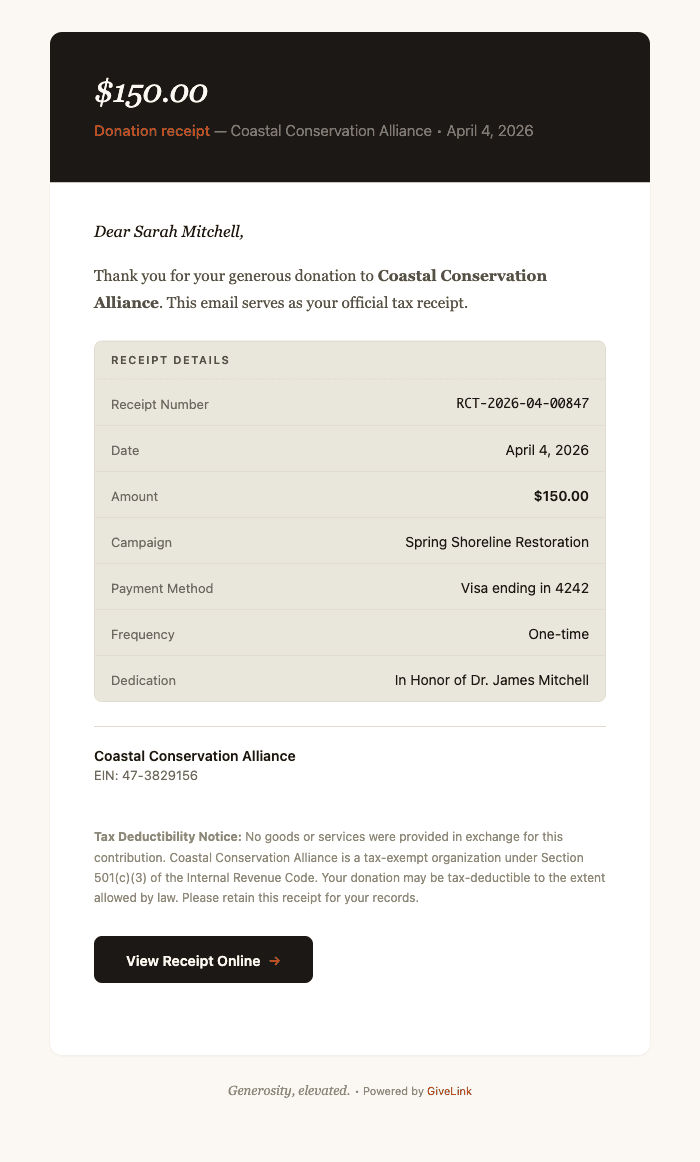
Charcoal Hero Headers
Every email opens with a dark charcoal header — not a bright, attention-grabbing banner, and definitely not the big orange/blue blocks that most platforms default to. Charcoal feels premium without feeling corporate. It's the same background you'd see in a beautifully typeset book jacket or a high-end restaurant menu.
The headline inside is set in Georgia italic. Not bold. Not uppercase. Italic serif, light weight, cream-colored text on charcoal. It reads like the opening line of a letter, not a marketing blast.
We made this choice deliberately. When a donor opens a receipt or a thank-you email, we want the first visual impression to say "someone wrote this for you" — not "this was generated by a system."
Georgia Serif Body Text
The body of every email uses Georgia at 15.5px with generous line height. There's a reason Georgia has survived 30 years of web typography: it was designed specifically for screen reading, it renders beautifully at small sizes, and it carries the warmth of print.
Serif body text in email is uncommon. Most platforms use system sans-serif — clean, efficient, forgettable. We chose serif because these emails aren't status updates. They're acknowledgments of generosity. A donation receipt is a thank-you note. A year-end statement is a record of someone's impact. A follow-up email is a relationship touchpoint. These deserve the warmth that serif typography brings.
The greeting line — "Dear Sarah," — is set in Georgia italic. It looks handwritten. That's the point.
Warm Earth Tones
The color palette is built from five tokens:
- Charcoal (#1C1917) — headers, primary buttons, emphasis
- Terracotta (#C4501E) — accents, CTA arrows, section headings
- Olive (#535146) — body text, subtle UI elements
- Warm Cream (#E9E6DC) — detail table backgrounds, callout fills
- Cream (#FBF8F3) — email background, header text
No bright blues. No neon greens. No gradient buttons. The palette feels like a well-lit room with wood floors and linen curtains — warm, grounded, trustworthy. These aren't colors that demand attention. They're colors that earn trust.
The terracotta appears sparingly — in CTA button arrows, in section headings, in the occasional badge. It's the accent that gives the palette life without overwhelming the content.
Consistency as Architecture
A design system isn't just about looking good. It's about looking the same — everywhere, every time, without anyone having to think about it.
We built 13 shared components that every template pulls from:
- Branded layout — the charcoal header, white body, and cream footer wrapper
- Greeting — italic serif "Dear [Name],"
- Body paragraph — serif text with proper spacing
- Detail table — warm cream background with olive section headers (used for receipt line items, subscription details, donation summaries)
- CTA button — charcoal with cream text and a terracotta arrow
- Callout — left-bordered info or warning box
- Org block — organization name, EIN, and address
- Signature — "With gratitude," followed by italic name
- Legal text — small, muted compliance copy
- Data table — multi-column with alternating row colors (used for year-end statements)
- Heading — italic serif section headers in terracotta
- Unsubscribe — subtle footer with divider
- Badge — inline terracotta label
When a developer on our team creates a new email template, they don't make design decisions. They compose from these components. The greeting always looks the same. The detail table always has the same spacing, the same border radius, the same section header treatment. The CTA button is always charcoal with a terracotta arrow.
This means a donor who receives a donation receipt, then a thank-you email a week later, then a campaign update a month after that, experiences one coherent visual identity across all three. Not three emails that happen to have the same logo.
The Templates
Here's what the system covers — every automated email a donor or admin receives from GiveLink:
Donor-facing:
- Donation receipt (tax-compliant, with line-item detail table)
- Welcome email (first-time donor onboarding)
- Thank-you follow-up (7-day and 30-day variants)
- Year-end giving statement (full donation history table)
- Refund confirmation
- Subscription change notification (plan upgrades, downgrades, cancellations)
- Payment reminder
- Campaign update (organization news and milestones)
- Tribute/dedication notification ("A gift has been made in honor of...")
- Donor portal magic link
- Email sequence steps (drip campaigns)
Admin-facing:
- New donation notification
- Dispute/chargeback alert
- Weekly activity digest
- Team member invite
Every one of these uses the same layout, the same components, the same colors, the same typography. A donor opening their year-end statement sees the same visual language as the receipt they received in January.
Why This Matters for Your Nonprofit
If you're evaluating fundraising platforms, look at the emails. Not the campaign pages. Not the dashboard. The emails.
Campaign pages are seen once — when a donor decides to give. Emails are seen repeatedly — every receipt, every follow-up, every update, every year-end statement. They're the most frequent touchpoint between your organization and your donors, and they're the touchpoint most platforms treat as a checkbox feature.
When your donation receipt looks like it was designed with the same care as your website, donors notice. When your thank-you email reads like a letter instead of a notification, donors feel it. When your year-end statement arrives looking polished and professional, donors trust you with another year of giving.
Design isn't decoration. In fundraising, it's infrastructure. It's the difference between a donor who gives once and a donor who stays.
We built GiveLink because nonprofits deserve tools that match the seriousness of their mission. The 15 email templates we shipped this week are one piece of that commitment — and they're included for every organization on GiveLink, with no design add-ons or premium tiers required.
Generosity, elevated.

Salesforce consultant turned nonprofit tech builder. Believes every dollar of generosity should reach its intended destination.
More from product
Introducing GiveLink Docs: The Most Thorough Documentation in Fundraising
We just launched docs.givelink.ai — an AI-native documentation site that sets a new standard for fundraising platform docs. Here's what makes it different.

Welcome to the GiveLink Blog
We're launching a blog to share what we're building, why we're building it, and what we're learning along the way.

Nonprofit Email Fundraising: Templates, Timing, and What Actually Works
Email drives more online donations than any other channel. Here's what the data says about subject lines, segmentation, send times, and sequences that convert.